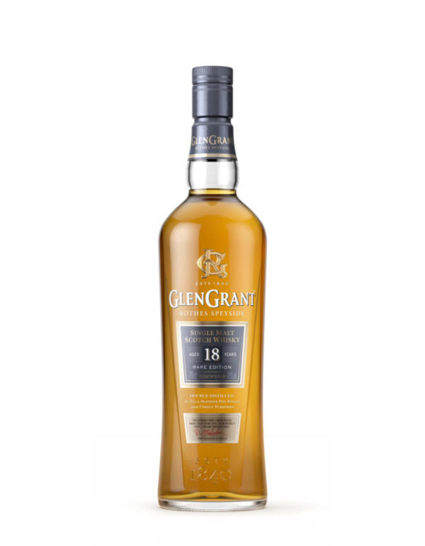
To celebrate the addition of two new variants, Glen Grant needed new packaging to highlight the brand’s unique process, its quality credentials and rich history.
The bottle concept was designed by Nude Design and created and manufactured by the team at O-I Alloa.
The container’s clean vertical facets reflect the idea of the pot stills taking just the best cut of the whisky vapours. The bottle uses clear flint glass to showcase the bright, golden whisky itself and is completed with a cork stopper, clad in tamper-evident decorated capsule. A new brand icon based on the Grant family seal adds cachet to the design and a new colour palette aids consumers in identifying the different dram varieties.

We are delighted to launch our new range of aged products and unveil our brand new contemporary logo and packaging. We are extremely proud of our new look, which perfectly represents the passion, craftsmanship and family heritage of Glen Grant, while staying true to our Scottish heritage. We are confident that through our unique quality and history, our new aged range of products will prove extremely popular with our consumers.