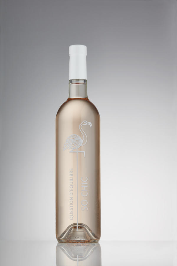
Rosé So Chic is a new project by Vignerons des 3 Châteaux. Following the success of their other wine, Question d’Equilibre, the company decided to create a new premium edition. They wanted a bottle that would match the new wine’s chic character.
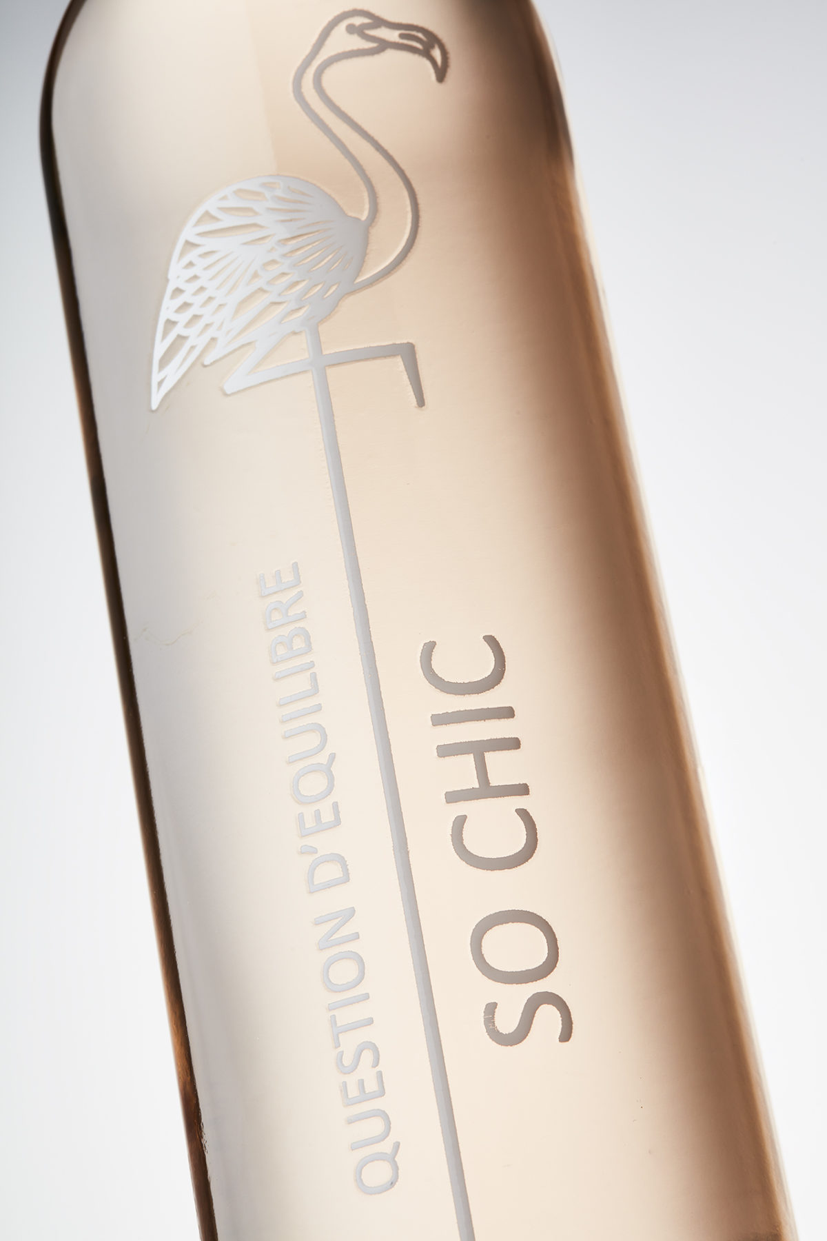
A standard BD Rivage bottle and traditional paper label, used for Question d’Equilibre, served as base of this design. To premiumize the bottle, the company turned to the experts at O-I : EXPRESSIONS, an innovative solution of direct printing on glass. The paper label was replaced by direct-to-glass printing solution offering a more sustainable option. The image of a flamingo is featured in O-I : EXPRESSIONS RELIEF to offer a tactile and more premium consumer experience, a “touche so chic” according to our customer. The final result in white print offers a minimalistic, simple, and premium design. This new wine will be distributed in Bretagne, North of France.
At O-I, we believe glass elevates every experience. Glass has a touch of magic. It plays with the senses of sight, sound and touch to transform moments large and small. Rosé So Chic with Vignerons des 3 Châteaux shows how our team specializes in bringing brand stories to life through glass packaging.