Packaging has long been a synthesis of form and function. As products on the shelves proliferate, brands need to differentiate more and more, and storytelling becomes critical. More than 70% of buying decisions are made in-store so packaging needs to tell that story at one glance. This article explains the variety of ways in which glass packaging design is influenced by factors outside the primary function of the pack.
Glass design is driven by a variety of influences. Firstly, there are those elements that tell the brand and product story at First Moment of Truth (in-store) and Second Moment of Truth (when the goods are consumed). Secondly, there are a variety of cultural influences through which the same story can be told differently based on geography. Finally, there are the brand’s practical constraints, such as the nature of the production lines, speed to market, price point, the need for value engineering and, increasingly, sustainability.
Taking geographic and segment differences first, spirits and non-alcoholic beverages (NAB) are the segments where design differences of the container itself are most marked. O-I finds that beer and food containers tend to be slightly more generic – differentiated more by labelling than by container design itself. Both beer and food containers share certain ‘must have’ characteristics which limit design variation.
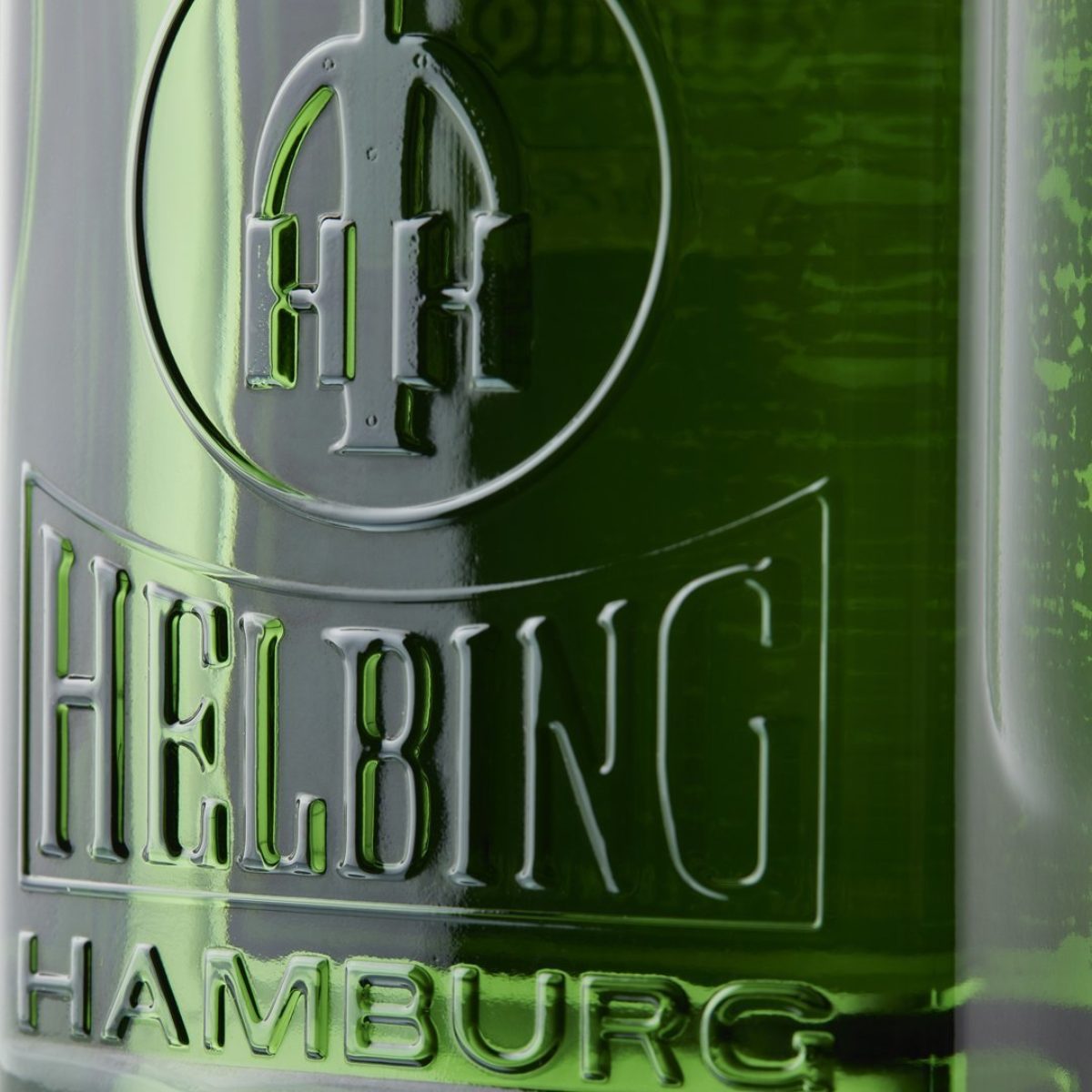
Within a segment like spirits, there are similarities and codes highlighted by product type and geography. For instance, a Czech or Polish vodka will contain distinct clues on the bottle as to its source. These brands tend to use a heavy shape and chunky embossing. The fundamentally square, green packs of German shorts (Jaegermeister and Helbing to name but two) contrast with the ambers and rounded shapes of whisky-based liqueurs such as Stroma, Drambuie and Baileys.
This is very different from, say, a Bacardi rum, which has a more generic appeal, with point of origin seeming less important than the globally-promoted brand image.
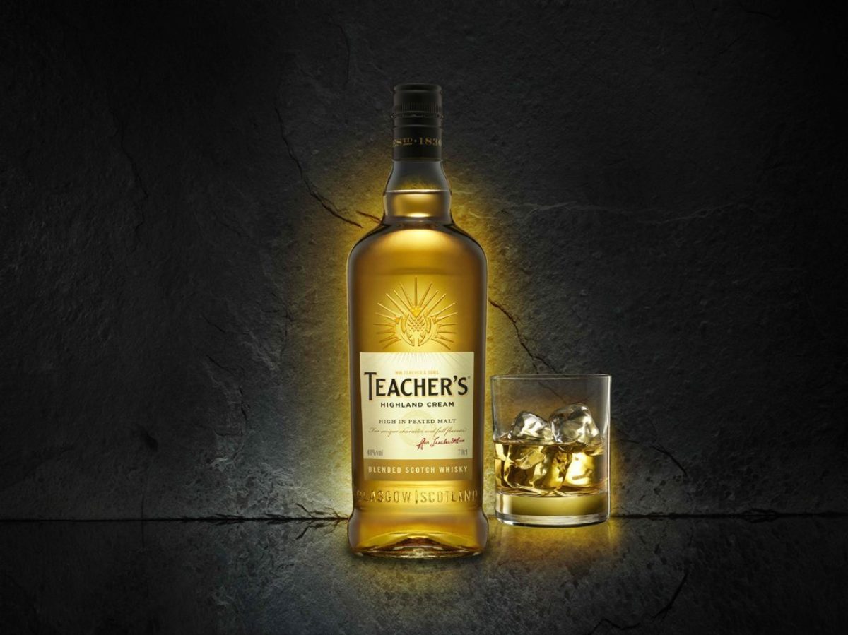
Similarly, Scotch whisky bottles tend to be more distinct than those for Irish whiskey. Consider the pot still neck shape of many Scotch whiskies and the use of embossing to highlight authenticity, heritage and Scottishness of the brands. Even a brand creating a modern image, like Teacher’s, uses stylised thistles on the bottles.
The shorthand communicated here is that where the provenance and authentic source of the spirit is most important for the brand, then the more distinctive the bottle will be.
Wine also has its specific design signals, which as much differentiate the type of wine as its terroir. The Bordeaux, Burgundy or champagne shapes are all different but reflect tradition - they immediately indicate the style of the wine, even if the product is from a different country. For instance, a pinot noir will almost invariably come in a Burgundy-shaped bottle, no matter where the grapes are grown or the wine is filled.
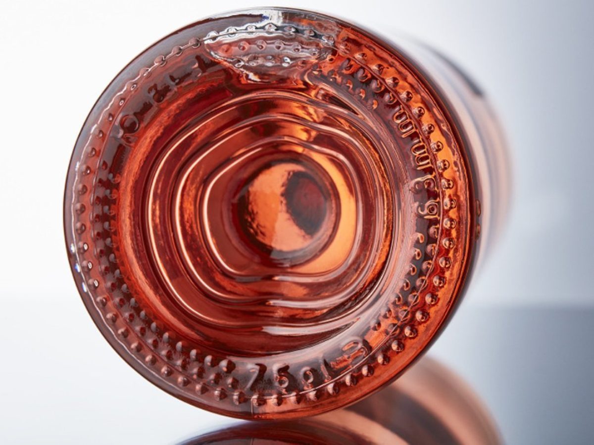
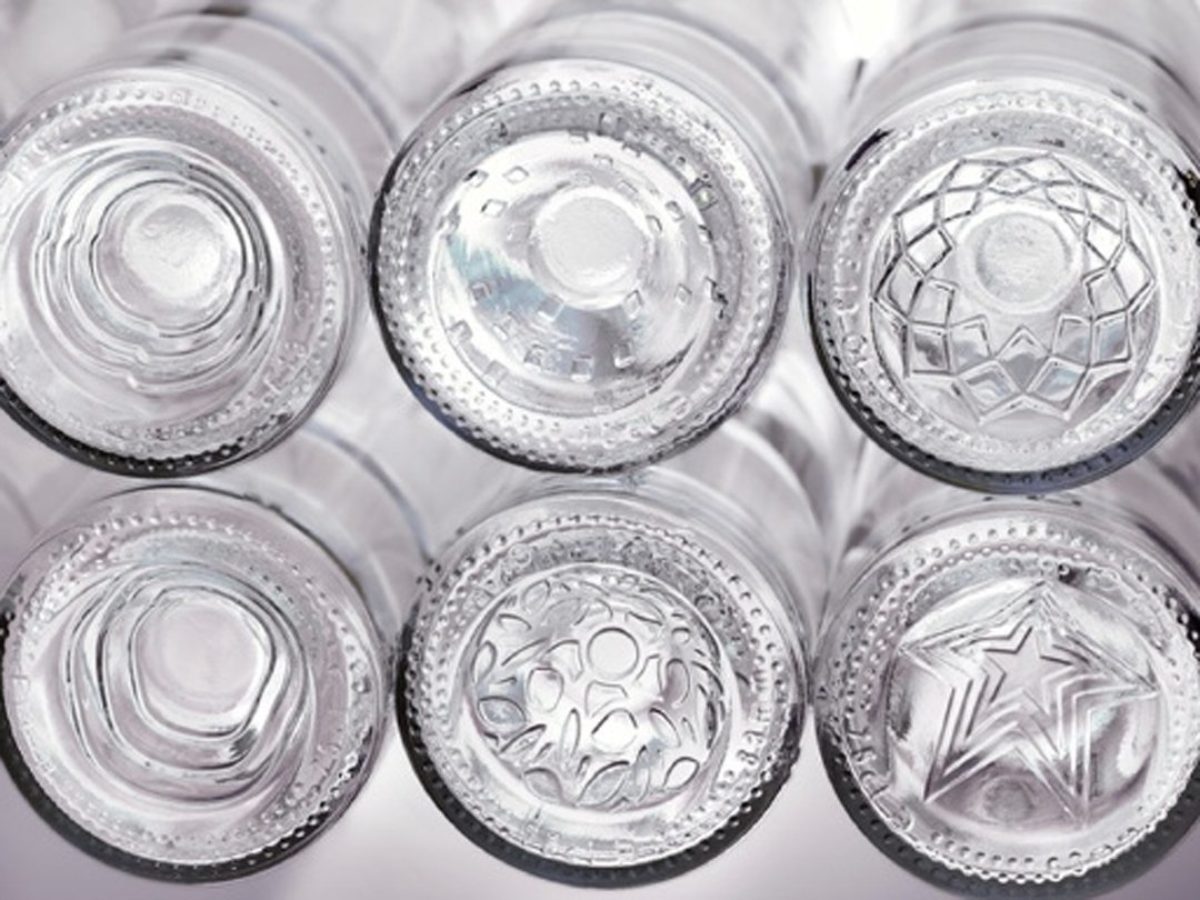
On the other hand, rosé wines tend to be much more innovative with packaging shapes. Vintners, like Producteurs de Pleimont, have adopted embossed bases to create a point of difference: designs such as wavy lines in the push up create a reflection and visual impact through the transparency of the flint bottle and the clear colour of rosé wine.
Some of the most intriguing examples are provided by crossover products, when cues from one segment are deliberately thrown into relief in an unusual context. A good example of this is the glass bottle for Tuborg Boilermaker, designed by O-I for production in Russia. The beer is flavoured with bourbon whiskey and Carlsberg added cues from bourbon packaging into the beer bottle design.
There has been a marked rise in nostalgia as a design trend, matched perhaps by a yearning for apparently simpler, more natural and certainly more sustainable times.
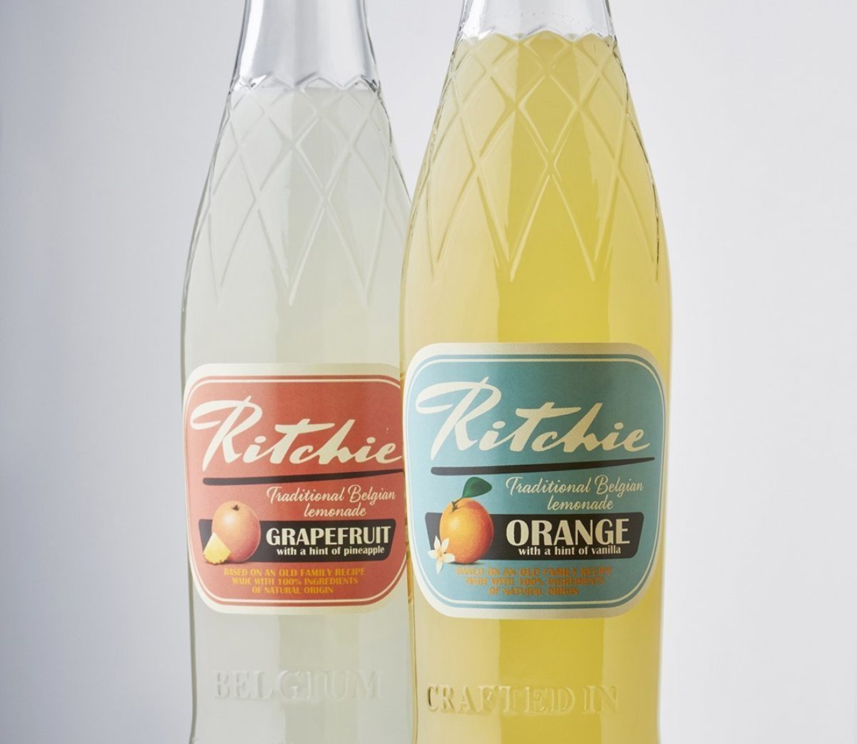
The NAB sector has been quick to capitalise on retro design cues. Affluent adults are being weaned off alcohol with high quality, premium soft drinks which reconnect them with their childhoods. Ritchie Lemonade is a trailblazer for this new style of craft NAB and its design is shamelessly nostalgic.
The antique ‘oil can’ design of US craft vodka from Rocker Spirits similarly highlights the golden age of Americana to provide brand differentiation.
Historically, new entrants to a market often start in a standard glass bottle and then migrate to a bespoke design as volumes grow. Recent trends in the soft drinks and waters arena indicate that start-ups are investing in bespoke designs from the off. This contrasts with the independent beer market, where entrants are often reliant on a craft filler. Here, the standard bottle remains supreme, with differentiations supplied by label design.
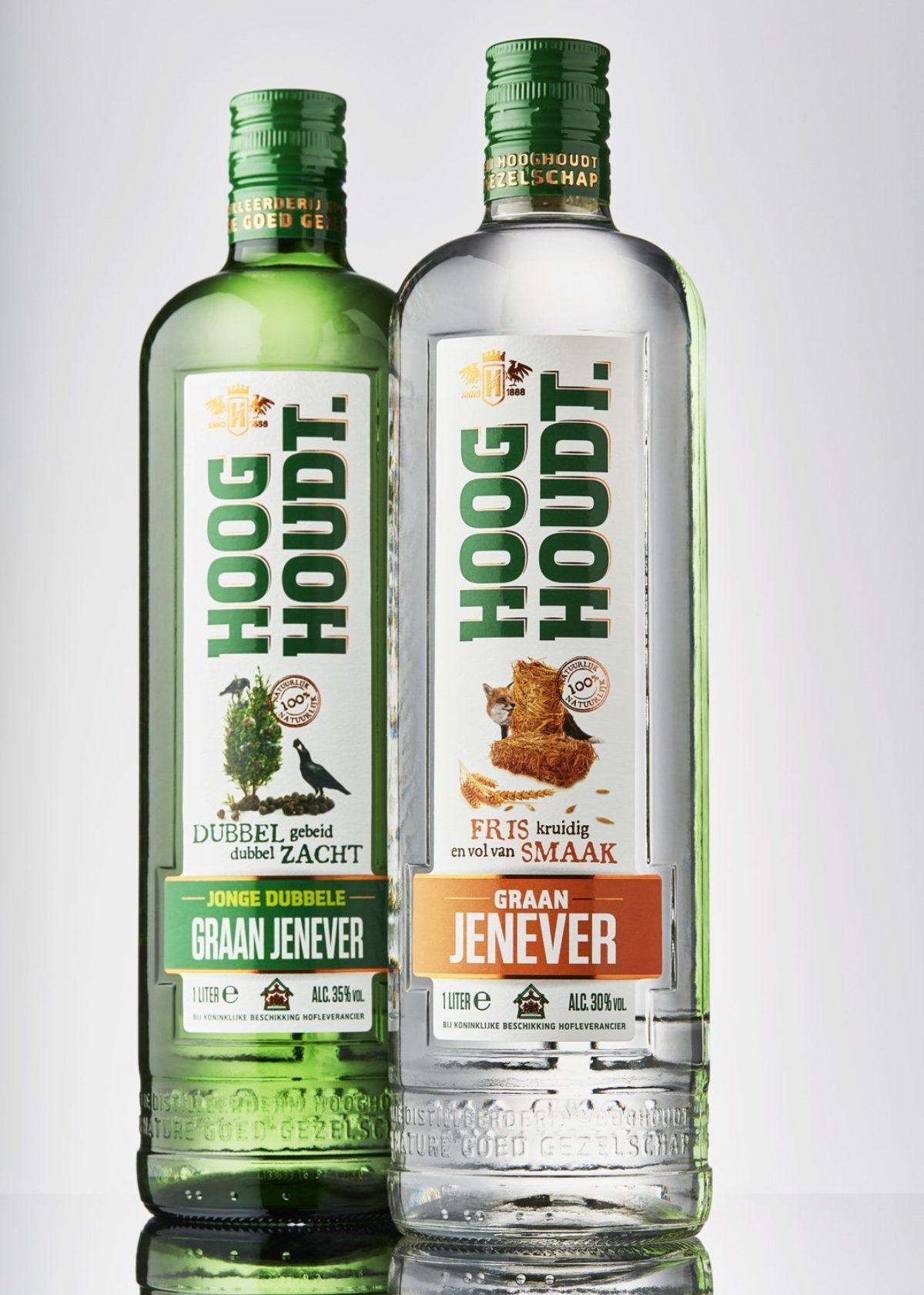
Gin is one sector in which no rules seem to apply at all. The variation is enormous – from elegant, pastel-coloured bottles like Silent Pool through chunky, black apothecary styles like Hendrick’s to the tall but heavily embossed Jenever brand Hooghoudt. Separating oneself from the pack through bespoke bottle design is the norm for start-up gin brands.
Gin and associated niche spirits are the fields in which most innovation is taking place – internal embossing, unusual colours, wraparound graphics, nothing is off limits for the category.
In segments where craft is growing most vividly, like gin, we see more variety in packaging design, whether through shape, decoration or labelling. Craft brands have more need than most to communicate an authentic story and find that packaging gives them a chance to tell it via the pack. More established brands may be more rigid in evolving their packaging as there is a fine line between evolution and losing your identity. We can all name brands which have brought out radical packaging evolutions and seen sales dip, causing a move back to something with which their core consumer can more easily relate. Identifying what are the key cues that tell your brand identity on your packaging is critical before starting any new redesign project.
Packaging does not exist in a design vacuum; it is also influenced by what is going on in the worlds of fashion, automobiles and other premium product niches. What is in vogue at present includes gradient colours (now available in glass through modern coating processes) and a scaling down of ‘in your face’ branding. Pepsi is just one of the world’s best-known brands to have taken a simpler, almost minimalist, approach to packaging design.
The final influence on design is simple economics. Value engineering in packaging is far more than simply lightweighting. Fillers can reap significant benefits by ensuring their brands are process-friendly and can share logistics and secondary packaging with others coming off the same lines. As a result, the pack is seen not in isolation but as part of a complete supply chain in which all elements need to integrate a minimal additional cost. O-I is working with many customers on rationalisation of the number of different designs used across ranges – reducing the number of bottle shapes means less investment over time and less complexity and margin for error in the filling process. The trick is to rationalise in a way that still enables differentiation and each identity to come through.
With increased global concern about the environment, the importance of sustainable design will play a much greater role in all packaging decisions; returnable and 100% recyclable glass, with its well-established collection infrastructure across Europe, is well placed to provide customers with fresh options for all their food and drink products. Like all glassmakers, O-I is constantly investing in improved design concepts and production technologies to further enhance the environmental acceptability of its packaging.
Our design teams around the world are working with customers to ensure they receive the optimum pack for their premium lines taking these myriad influences into account. Whatever the brand objectives, whatever the story, glass has the flexibility to bring it to life.
To celebrate glass design, O-I launched in December 2017 its first Design Book edition, inviting readers to take an inspirational look.
*Originally published in Packaging Europe.